Kaiser Permanente
Flagship Mobile App
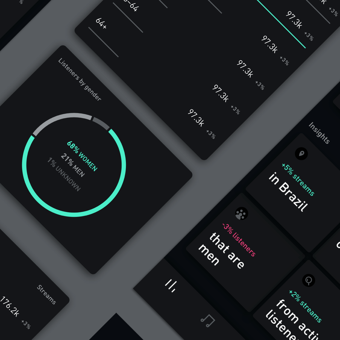
Designing for the modern musician
Role
Creative Director
/ Experience Direction
/ Art Direction
Platform
iOS & Android
Year
2019
Timeline
4 Months
Company Overview
Founded in 1945, Kaiser Permanente is recognized as one of America’s leading health care providers and not-for-profit health plans. They currently serve 12.2 million members in 8 states and the District of Columbia.
Kaiser’s integrated care model, by combining insurance, care delivery, and pharmacy gives them a competitive advantage in creating an efficient and convenient customer experience
— KP Mobile
The Challenge
Historically, the mobile strategy has been based on achieving parity with the desktop KP.org experience. As a result, the KP flagship mobile app has been viewed as a secondary focus leaning towards transactional functions versus a complete health experience.
Additionally, as mobile app visits are projected to overtake desktop visits in the next year, it will become one of the most critical customer engagement points moving forward.
— Looking outward
State of the Industry
A number of emerging start-ups that are beginning to disrupt the healthcare industry. Each has a unique take in using patient data and technology to provide a unique take on patient experiences.
Forward → Consumers and technology at the heart of healthcare
23andMe → Preventative care based on DNA testing
TytoCare → Push toward home-based care
— Current State
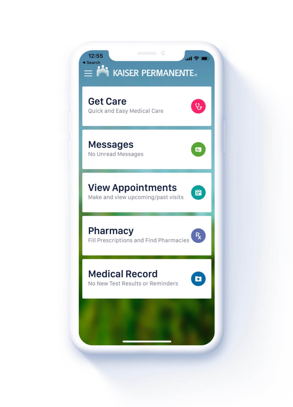
A reactive,
transactional app
— Future Vision
A dynamic, relationship-driven care experience powered by data
– Digital Mission
Extend the ethos of Thrive:
to the KP mobile app.
Kaiser Permanente’s long-term mission of providing proactive and preventative care has potential for growth through mobile as the primary facilitator of care.
It’s not always easy to thrive, but it should be. Each member should be at the center of their own care team, with the KP mobile app by their side providing proactive assistance with a human touch.
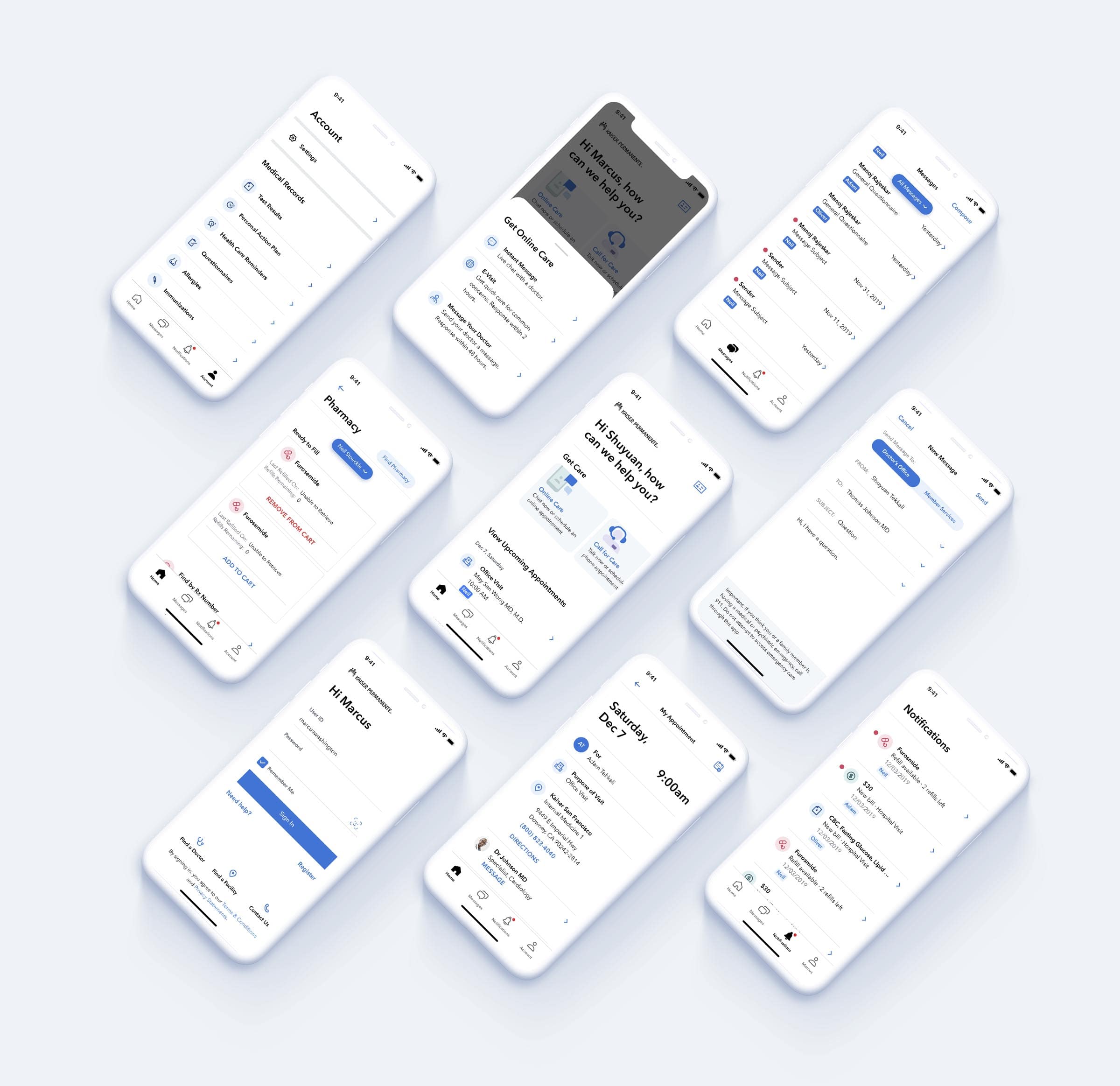
Design Recommendations
1. Personalization through proactivity
2. Simplify the navigation
3. Humanize the IA
4. Make the language conversational
5. Remove the friction
6. Uplift the look and feel
— One
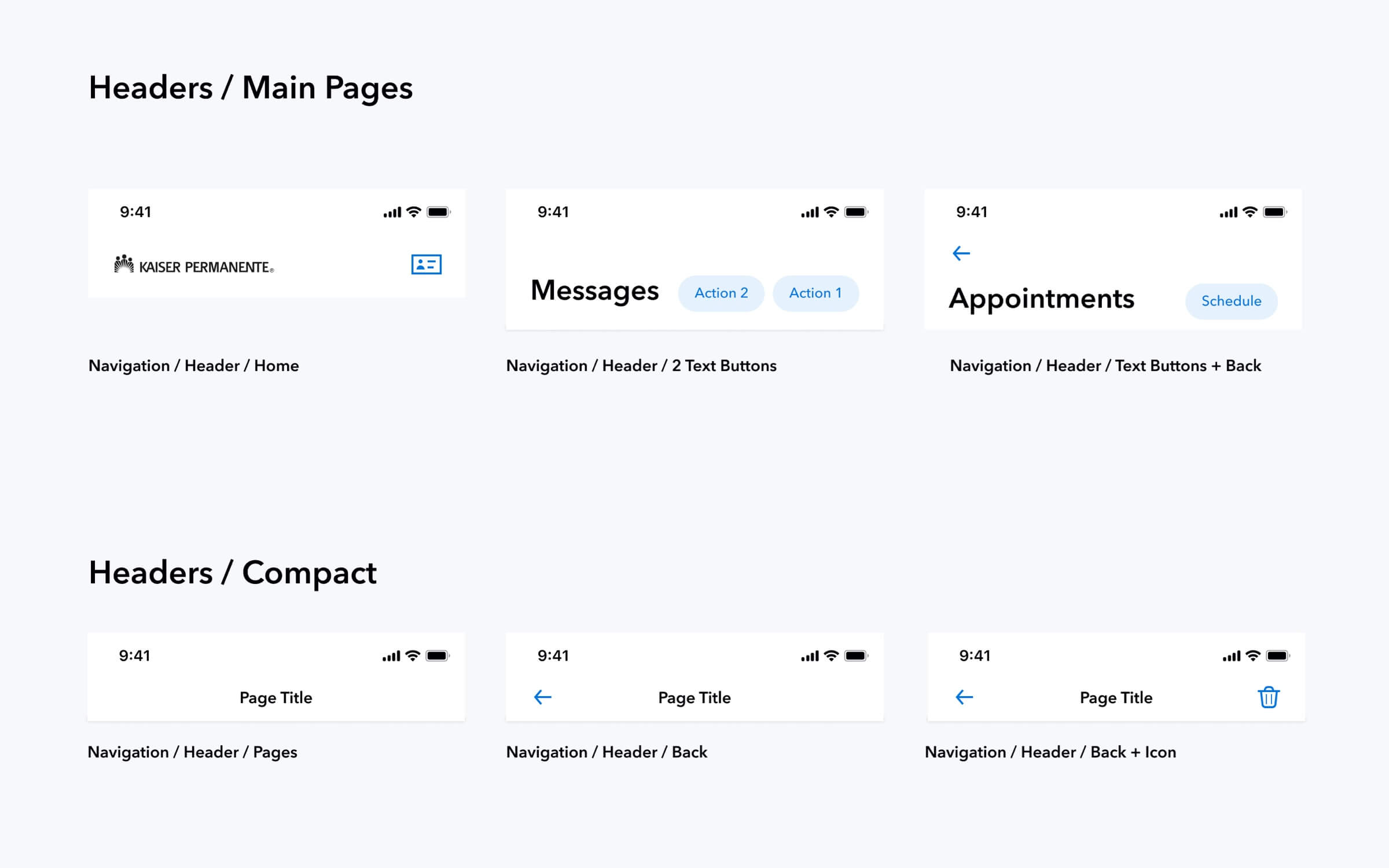
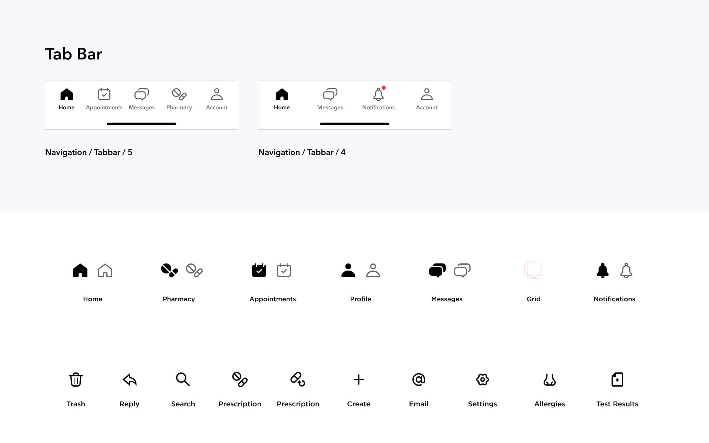
Build a component guide that is accessible by members of any mental or physical state
A KP member is likely to open their healthcare app because something is currently causing them a health concern, they could have a headache, fever, or any number of conditions. I believe accessibility should be built-in to a product as soon as possible, but even more so considered in cases where medical issues might be common.
— Two
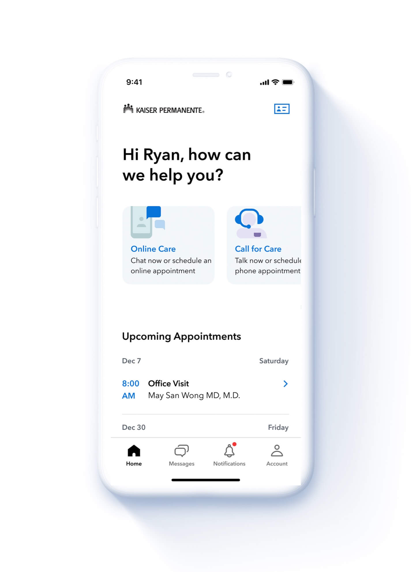
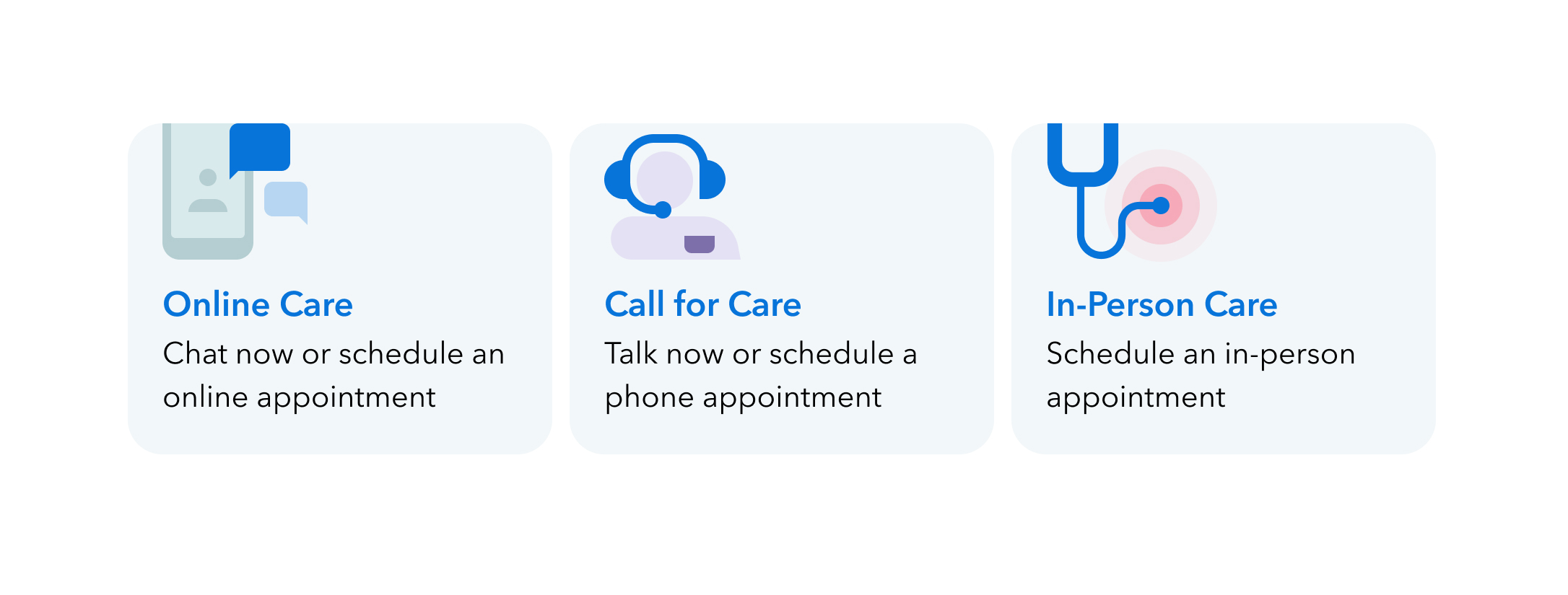
Simplify communication of avenues of care, both in-person and online
The primary-itention of a member opening the Kaiser app is to get care. In the current application get care is not only difficult to find but also contains quite a lot of confusing terminiology.
Most imporatntly the placement of this section needed to be clear and easy to find, so we reprioritized this section as the primary section of the dashboard, additionally sub-text had to offer supporting guidance.
— Three
Create a personalized dashboard focused on proactive care
The KP dashboard has the opportunity to:
1. Use conversational language to welcome members
2. Expose utility that members need most (get care)
3. Provide access to proactive content and personal actions

— Four
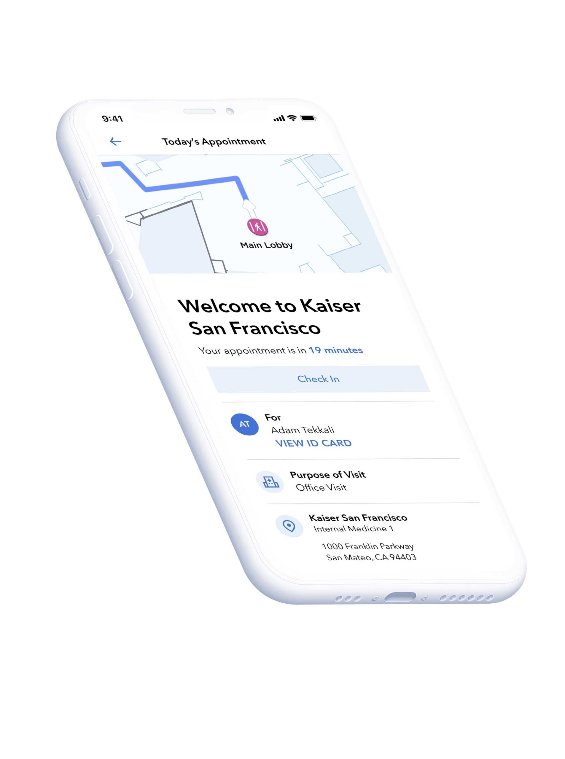
Develop a framework for an improved appointment experience
There are many stages and opportunities for moments of delight within the appointment journey that can be understood and designed for.
1. Appointment overdue recommendations
2. Day of checklist and directions
3. On-premise wayfinding
4. Post-visit summary
5. Medications and lab integration
— Five
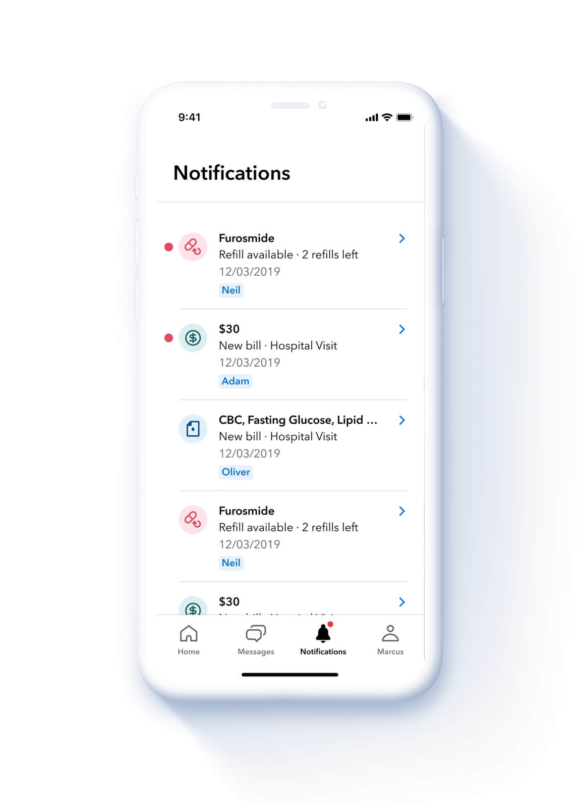
Tie it all together with a communication strategy that brings feedback to and clarity to members on their healthcare to-dos
Appointments and notifications are at the heart of the KP. Keeping track of appointments for yourself and your family should be easy to understand and act on. We also created clear notification system that keeps each member up to date with bills, labs, and medication refills.
Additional Projects

Johnson & Johnson (Auris Health)Surgical System Experience Design
Uber Eats Grocery LandingGrocery & New Verticals
DosistResponsive Web
Universal Music GroupResponsive Web
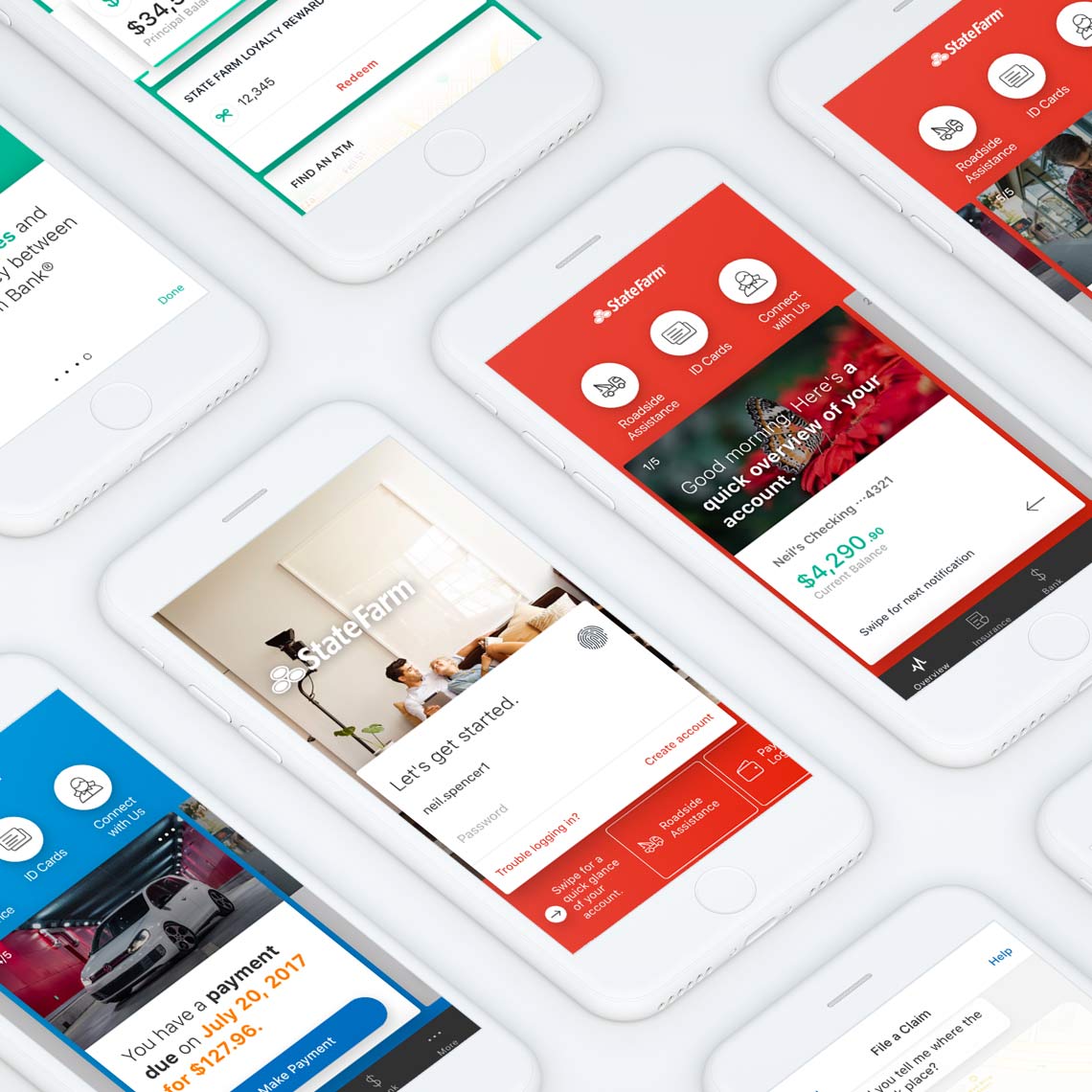
State FarmMobile App Redesign
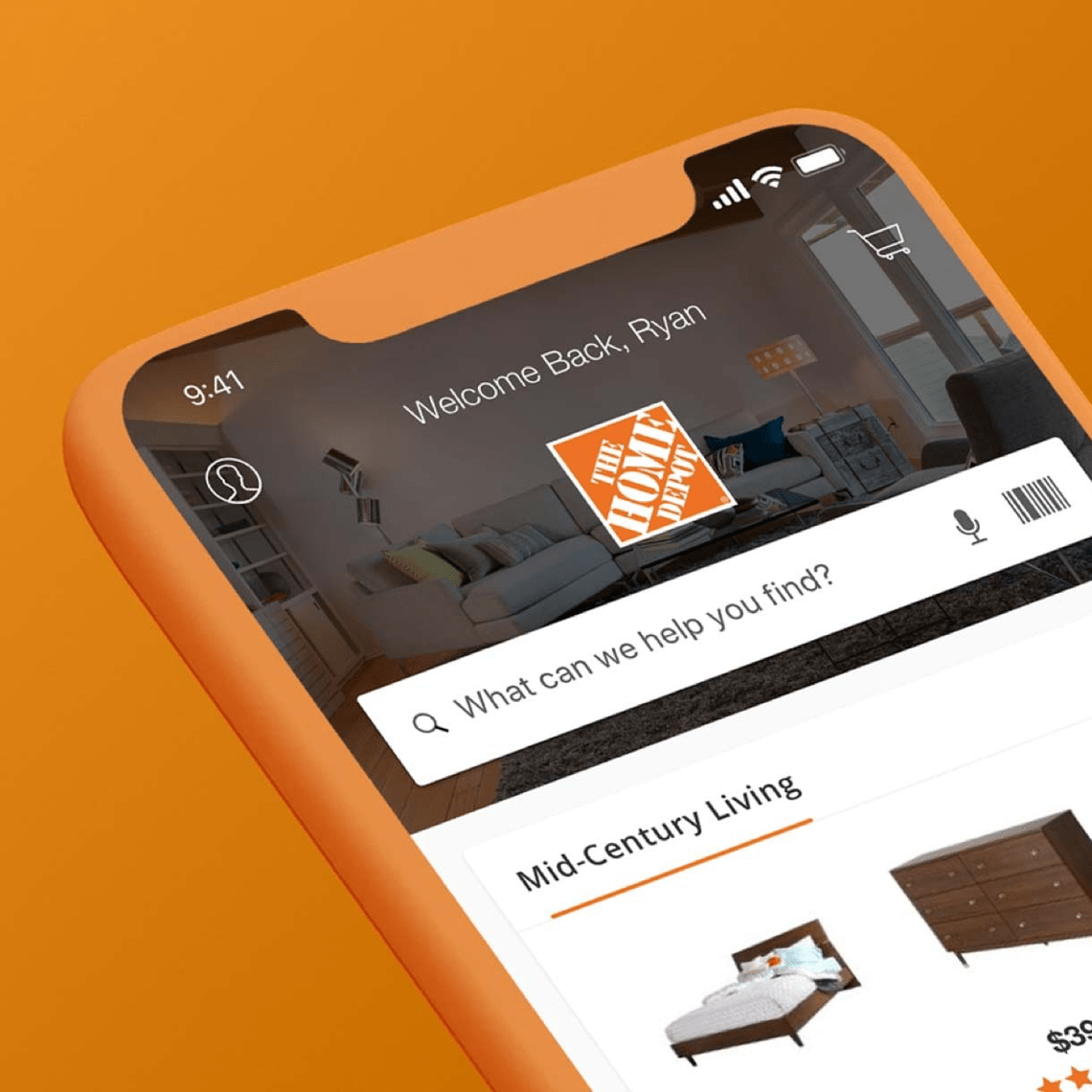
The Home DepotMobile App Redesign
 Say hello below.