State Farm
Flagship mobile application
Project Goal
Reimagine the State Farm flagship mobile application from the ground up. Create an experience that merges insurance and banking product lines into a single experience.
Reimagine the State Farm flagship mobile application from the ground up. Create an experience that merges insurance and banking product lines into a single experience.
Role
Role & Timeline
Creative Director
/ Experience Direction
/ Art Direction
Platforms
Platform
iOS & Android
Year
Year
2017
— Mission
"Make life go right"
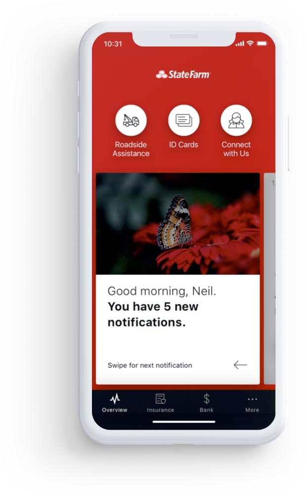
The new design experience is centered around customer satisfaction, self-service, and an increase in cross-sell opportunities with the State Farm app. The app is used as an effort to engage customers as well as enrich and simplify their lives.
The goal was to make the product approachable as possible to allow customers to feel as confident through every transaction as they would if they had their Agent taking care of them.
The new design experience is centered around customer satisfaction, self-service, and an increase in cross-sell opportunities with the State Farm app. The app is used as an effort to engage customers as well as enrich and simplify their lives. Our goal was to make the product approachable as possible to allow customers to feel as confident through every transaction as they would if they had their Agent taking care of them.
Overview
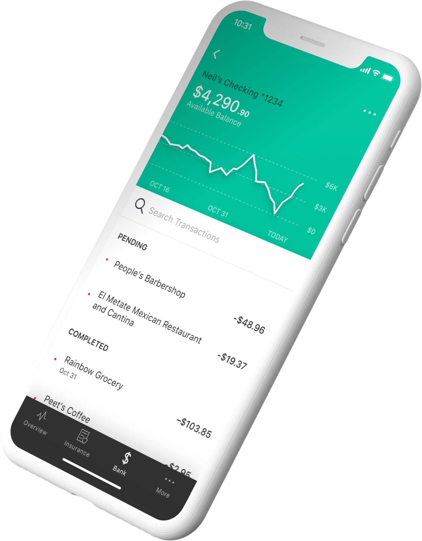
75% of customers who lapsed on their insurance policy simply weren't able find where to pay their insurance premium. This was a significant insight and opportunity to combine top actions and notifications to a singular location. The overview page aims to give the each user what they want, when they need it most.
The result was a brand new digital platform that gives people total transparency into their insurance assets. The redesign increases user control and simplifies the mobile experience so people can be proactive and prepared well before any accident ever occurs.
A brand new digital platform that gives people total transparency into their insurance assets. The redesign increases user control and simplifies the mobile experience so people can be proactive and prepared well before any accident ever occurs.
The result was a brand new digital platform that gives people total transparency into their insurance assets. The redesign increases user control and simplifies the mobile experience so people can be proactive and prepared well before any accident ever occurs.
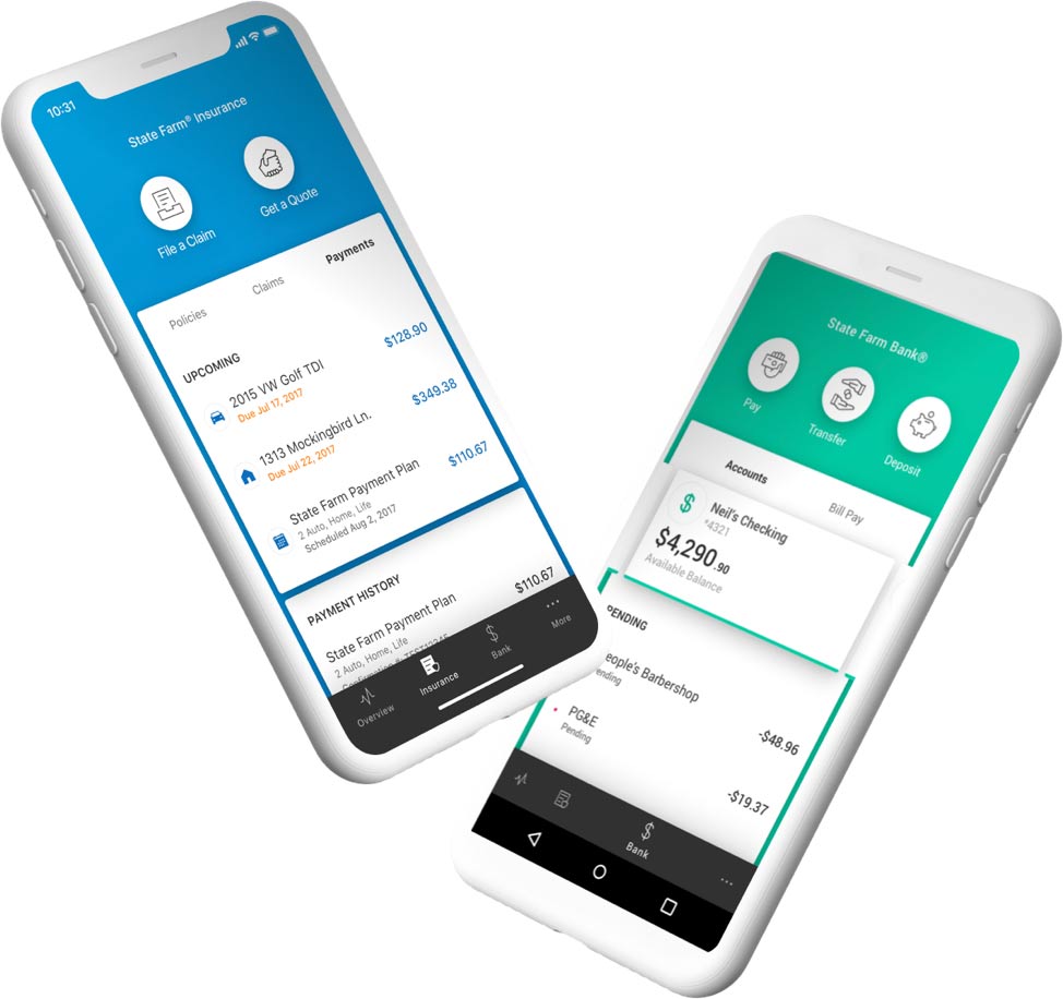
Insurance & Banking
Through visual design create a clear understanding of banking verses insurance. Within those navigational areas, provide the member with access to key actions such as filing a claim or transferring money.
The result was a brand new digital platform that gives people total transparency into their insurance assets. The redesign increases user control and simplifies the mobile experience so people can be proactive and prepared well before any accident ever occurs.
A brand new digital platform that gives people total transparency into their insurance assets. The redesign increases user control and simplifies the mobile experience so people can be proactive and prepared well before any accident ever occurs.
The result was a brand new digital platform that gives people total transparency into their insurance assets. The redesign increases user control and simplifies the mobile experience so people can be proactive and prepared well before any accident ever occurs.
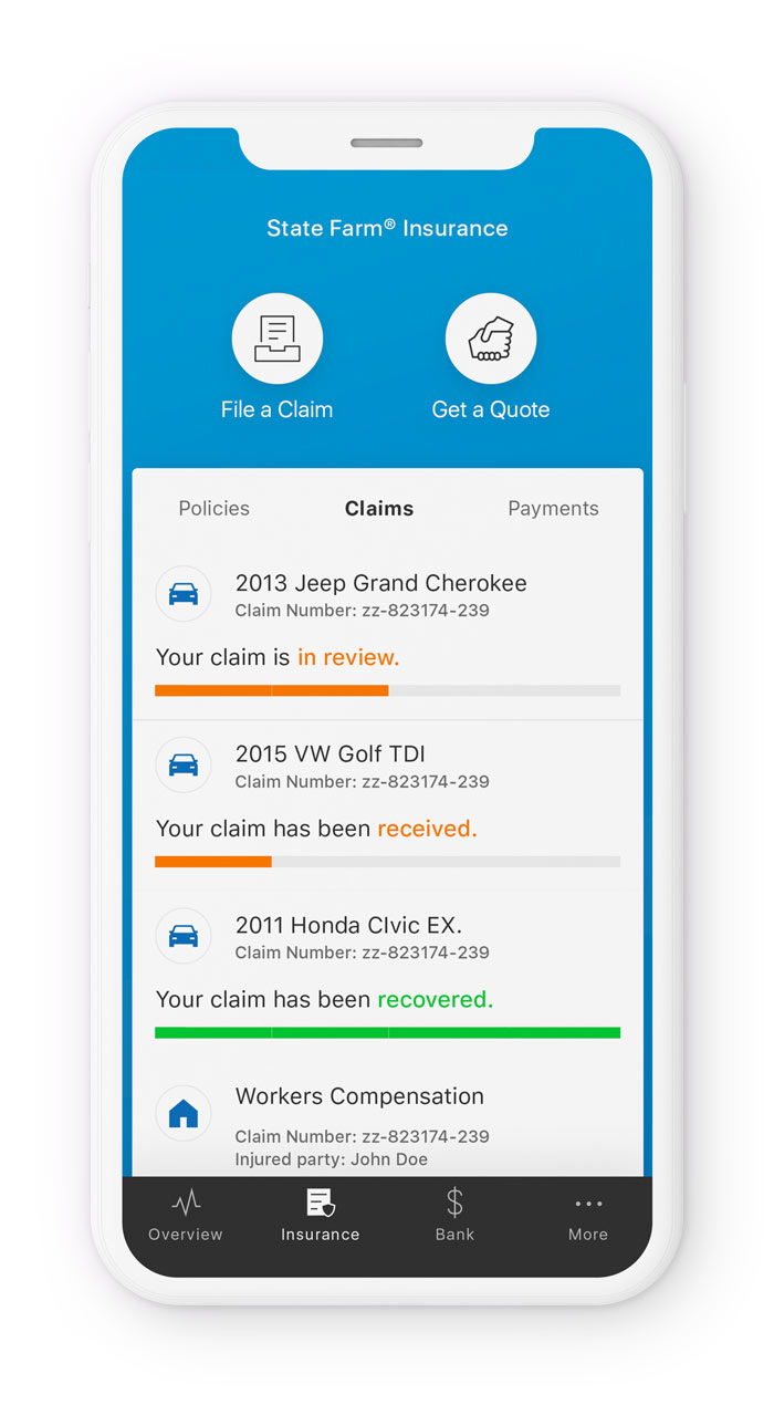
Claims
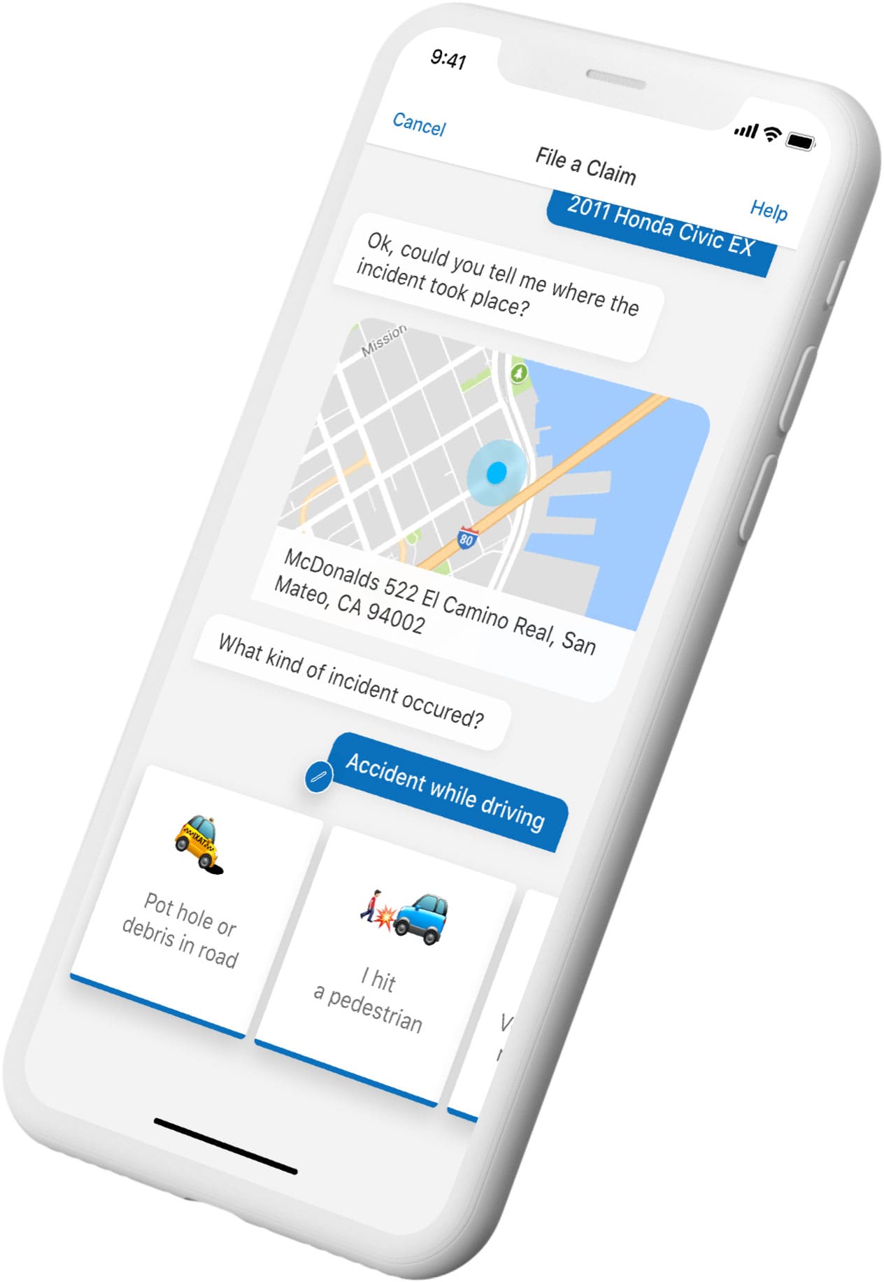
Claims can be a make-or-break experience for insurance customer – you know-that phone call after an accident which generally escalates from shock into profanity.
I wanted to get rid of that hectic immediacy by transforming the experience into an empathetic, step by step chat bot flow.
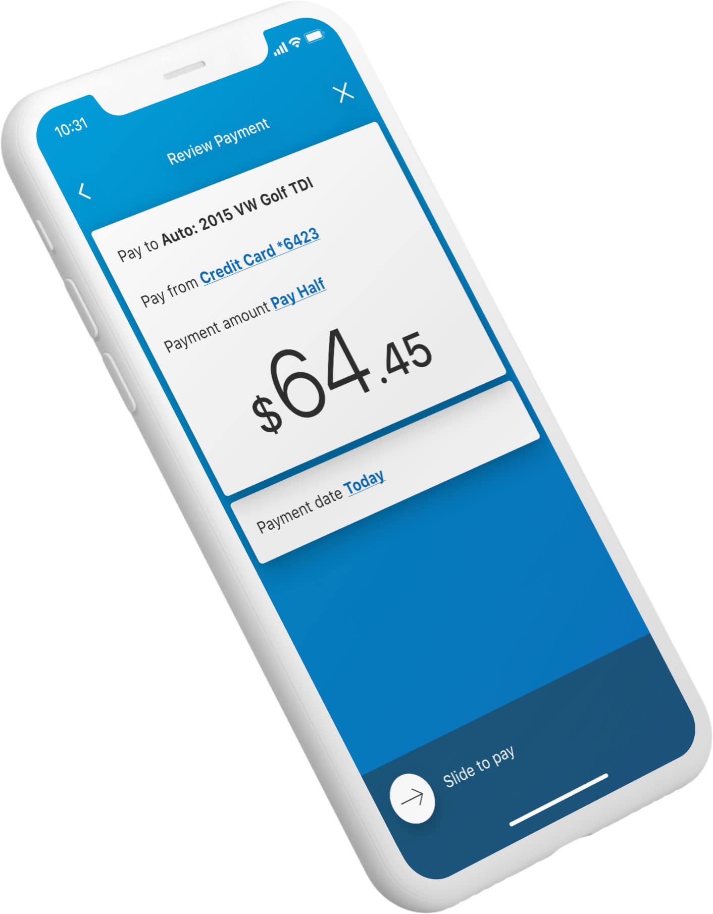
We worked with State Farm to increase mobile adoption through better organization of their products. They have a lot of products. It took finesse to properly merge insurance and banking, but the result was a beautiful, unified app, communicating between lines of service. Now, you can deposit a check and pay your insurance bill with it, all from your phone.
"This app is fantastic and literally gives you everything at your fingertips.”
"This app is fantastic and literally gives you everything at your fingertips.”
- App Store Review, LilBill56
- App Store Review, LilBill56
Track a Claim
The claims tab allows customers to easily follow any home, auto, or life claims that might be in progress. These are color-coded to ensure that the customer is aware of the next step in the process.
One experience that was causing significant user drop off was the process of filing and managing claims. You know-that phone call after an accident which generally escalates from shock into profanity. We wanted to get rid of that hectic immediacy by transforming the experience into an empathetic, step by step chat bot flow.
Outcomes

1.1m
1.1m
1.1m
Downloads in the first 6 months
Downloads in the first 7 months

25m
25m
App sessions in the first 6 months
App sessions in the first 7 months

1.9m
1.9m
Premium bills paid in app in the first 6 months
Premium bills paid in app

85k
85k
Stranded customers assisted in first 6 months
Stranded customers assisted in first 7 months of launch
Additional Projects

Johnson & Johnson (Auris Health)Surgical System Experience Design
Uber Eats Grocery LandingGrocery & New Verticals
Kaiser PermanenteFlagship Mobile Application
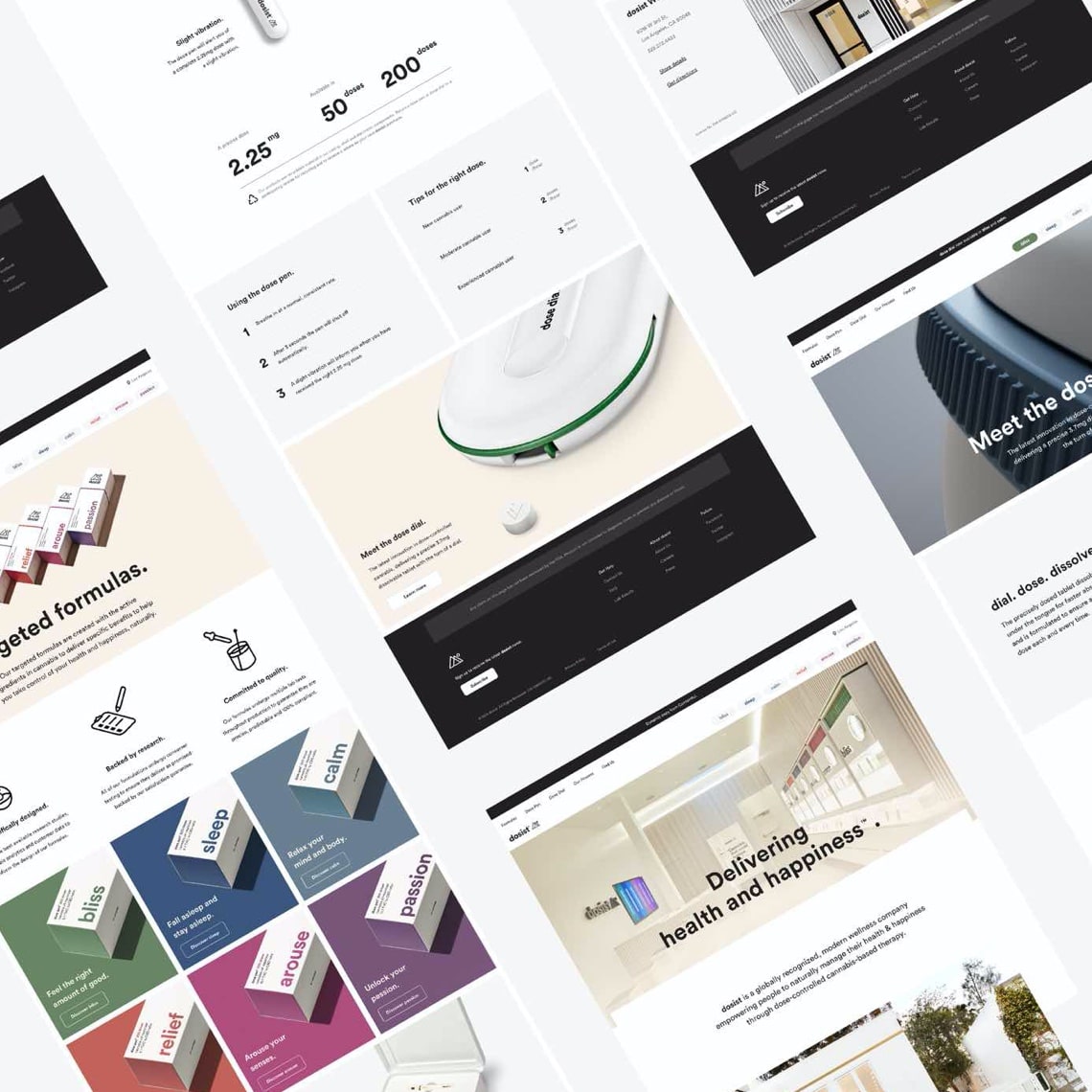
DosistResponsive Web
Universal Music GroupResponsive Web
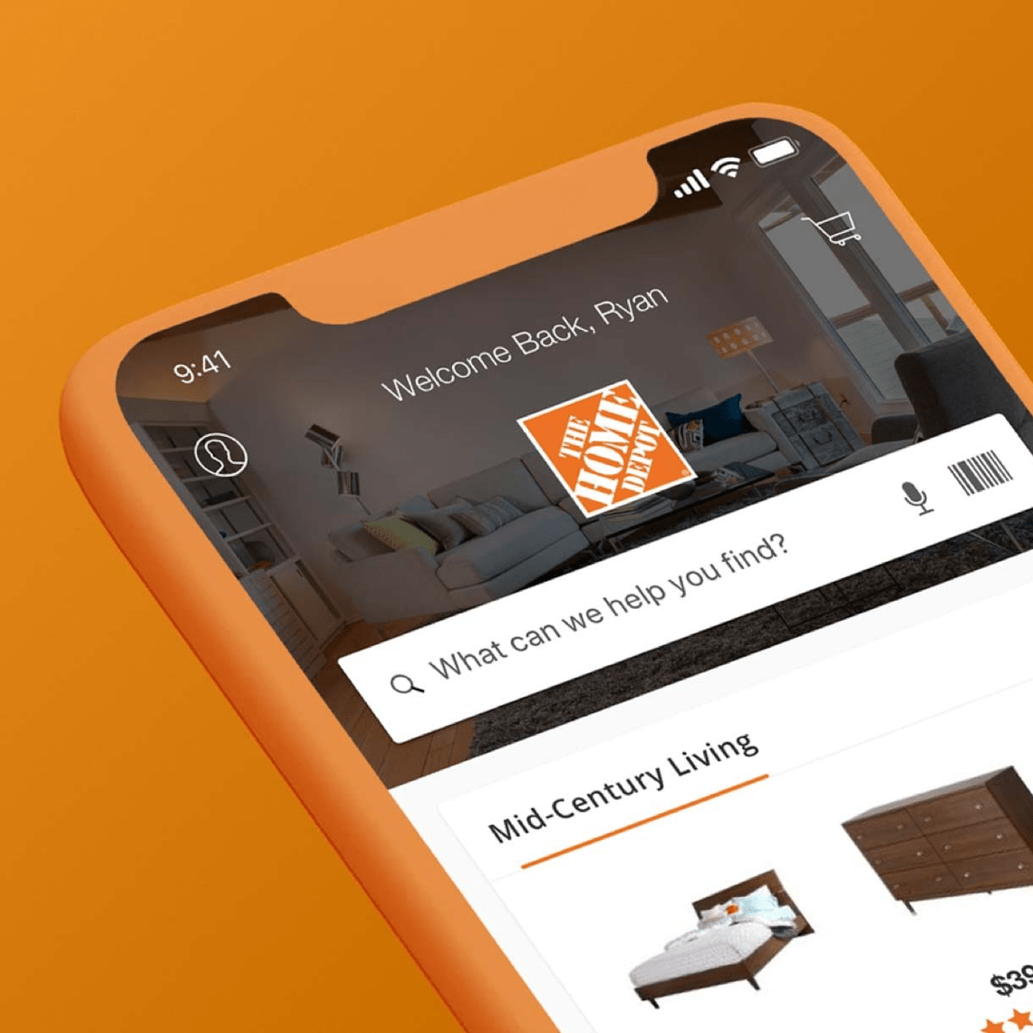
The Home DepotMobile App Redesign
 Say hello below.